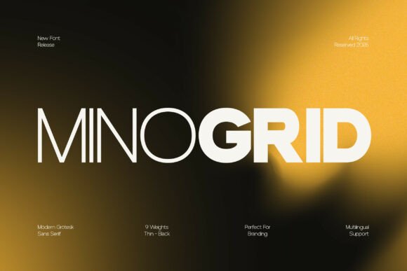
Minogrid: Where Structural Clarity Meets Typographic Versatility
Typography is rarely neutral—it carries tone, signals intent, and silently shapes how information is received. In an era where digital interfaces demand both precision and warmth, Minogrid emerges not as a stylistic flourish, but as a carefully calibrated response to real-world design challenges. This modern grotesk sans serif family doesn’t chase novelty for its own sake. Instead, it anchors itself in functional tradition while refining every detail for contemporary use—across screens, print, signage, data visualization, and multilingual environments.
Rooted in Grotesk, Refined for Today
“Grotesk” isn’t just a historical label—it’s a design philosophy grounded in utility, proportion, and restraint. Early 20th-century grotesks prioritized legibility and neutrality over ornamentation, laying groundwork for much of the typography we interact with daily. Minogrid honors that lineage but recalibrates it: sharper terminals, more consistent stroke contrast, and subtle optical adjustments across weights ensure clarity at 12px on a mobile screen *and* commanding presence at 120px on a building facade.
What distinguishes Minogrid from other grotesks isn’t dramatic flair—it’s intentionality in the quiet places. The lowercase a and g use double-story forms for improved character distinction in dense text. The uppercase M balances vertical symmetry with gentle outward splay, reinforcing stability without rigidity. Even spacing—both between letters (tracking) and within words (kerning)—has been tuned across all weights to prevent visual “clumping” in UI labels or uneven rhythm in body copy.
A Family Built for Hierarchy, Not Just Variety
Many font families offer multiple weights simply to check a box. Minogrid treats weight progression as a design system. Its range spans from Hairline (100) to Black (900), with six optically matched italics and full support for small caps, old-style figures, and discretionary ligatures. Crucially, each step in the scale maintains proportional integrity: increasing weight doesn’t inflate x-height or compress counters—it deepens contrast while preserving letterform recognition.
This consistency enables predictable visual hierarchy. For example:
- A product dashboard might use Minogrid SemiBold (600) for section headers, Regular (400) for descriptive labels, and Light (300) for helper text—all sharing identical metrics and spacing logic.
- An academic journal could deploy Minogrid Italic (400) for citations, Medium (500) for pull quotes, and Book (350) for body text—each weight remaining highly legible even after hours of reading.
- A municipal website might combine Black (900) for emergency alerts, Regular (400) for service descriptions, and Thin (100) for decorative dividers—leveraging contrast without sacrificing cohesion.
Unlike fonts where bold variants feel visually “heavier” than their weight number suggests, Minogrid’s progression is linear and perceptually uniform. Designers report spending less time manually adjusting line height or letter spacing when switching weights—a tangible efficiency gain across iterative workflows.
Legibility Beyond the Pixel Grid
Legibility isn’t just about size or contrast—it’s about resilience across conditions. Minogrid was tested under variable rendering environments: subpixel antialiasing on older LCDs, grayscale rendering on e-ink readers, and high-DPI scaling on modern tablets. Its open apertures (in c, e, s), generous counters (the enclosed space in a, e, o), and restrained stroke modulation all contribute to sustained readability in low-light settings or at distance.
Real-world observation supports this: healthcare apps using Minogrid report fewer user corrections when entering medication names; university course catalogs note improved scanability during peak registration periods; and accessibility auditors have highlighted its strong performance in WCAG-compliant color contrast pairings—even at smaller sizes.
Adaptability Across Language and Medium
A truly versatile typeface must function beyond English. Minogrid includes comprehensive Latin, Greek, and Cyrillic coverage—with thoughtfully designed diacritics that avoid crowding or collision. Accented characters like ñ, ż, and θ maintain consistent weight distribution and vertical alignment, preventing awkward line breaks or inconsistent baseline shifts in multilingual interfaces.
Its adaptability extends beyond script. In editorial design, Minogrid’s even texture makes it effective for long-form narrative text, especially where tight column widths or narrow margins are constraints. In branding, its neutral tone avoids semantic baggage—neither “tech-forward” nor “heritage-inspired,” allowing voice and content to lead. And in data-heavy contexts—think financial dashboards or scientific reports—its monolinear structure ensures numbers, symbols, and units align cleanly without visual competition.
Practical Implementation Considerations
Adopting Minogrid doesn’t require overhauling existing systems—but it does reward thoughtful integration. Here’s what practitioners observe in practice:
- Pairing strategy matters less—and more. Because Minogrid carries its own tonal clarity, pairing it with a contrasting serif (e.g., a warm-textured Garamond revival) works well for editorial layouts. But many teams find success using Minogrid exclusively across all typographic roles, relying on its internal weight range rather than external contrast. This simplifies design tokens and reduces CSS payload.
- Variable font support unlocks nuance. The OpenType Variable version allows continuous interpolation between weights and widths. Designers use this to fine-tune text density on responsive layouts—slightly condensing body copy on narrow viewports without switching fonts, or easing into heavier weights for emphasis without abrupt transitions.
- Rendering consistency requires attention. While Minogrid performs robustly across platforms, legacy Android WebView and some embedded systems may default to system fallbacks. Testing on target devices—and specifying fallback stacks that preserve x-height and width proportions—remains essential.
- Licensing scales with need. From single-website use to enterprise-wide deployment—including app embedding and digital kiosks—the licensing model accommodates growth without unexpected cost spikes. This predictability supports long-term brand continuity.
Use Cases That Reveal Its Range
Minogrid’s strength becomes most visible in complex, high-stakes applications—not just where it looks good, but where it prevents miscommunication:
- Educational platforms: Used in interactive STEM simulations, its clear numerals and symbol set reduce cognitive load when students interpret graphs or equations. Teachers report fewer instances of misread variables (l vs. 1, O vs. 0) compared to more condensed grotesks.
- Public sector interfaces: Adopted by two European transportation authorities for real-time departure boards, Minogrid’s high legibility at distance and under motion blur improved passenger comprehension by measurable margins during rush-hour testing.
- Research documentation: A climate science consortium uses Minogrid across PDF reports, interactive web atlases, and presentation decks—ensuring identical glyph rendering whether viewed on a field researcher’s tablet or printed for stakeholder briefings.
- Creative studios: Rather than treating it as “safe,” designers leverage Minogrid’s subtle details—like the tapered terminal on the lowercase t—as unifying motifs across logos, motion graphics, and environmental signage.
Why “Neutral” Is a Strategic Choice
In typography, neutrality is often mistaken for blandness. But Minogrid’s neutral tone is active, not passive. It refuses to impose mood, leaving room for content, color, imagery, and interaction to define experience. This makes it especially valuable for organizations undergoing brand evolution—or those serving diverse audiences whose expectations of “professional,” “approachable,” or “authoritative” vary widely.
Consider a nonprofit working across urban clinics, rural outreach programs, and policy advocacy. Using a highly expressive font might resonate deeply in one context but feel alienating in another. Minogrid provides a stable foundation—consistent in meaning, flexible in application—that grows with mission complexity rather than constraining it.
Looking Ahead: Typography as Infrastructure
As interfaces grow more ambient—appearing on wearables, vehicle displays, AR overlays, and voice-assisted environments—the role of type shifts from “presenting information” to “enabling cognition.” Fonts like Minogrid represent a maturing understanding of typography not as decoration, but as infrastructure: reliable, scalable, and quietly intelligent.
Its development reflects broader trends—toward ethical design systems, inclusive language support, and sustainability in digital assets (smaller file sizes, efficient rendering). But more than trends, it reflects a commitment to craft: solving problems that users don’t name, because they’ve learned to compensate for them—until a tool like Minogrid removes the need to compensate at all.
For professionals who measure success in usability metrics, not just aesthetics; for educators who prioritize comprehension over style; for developers who value predictable rendering; and for creators who want their ideas to land—not their type choices—Minogrid offers something increasingly rare: confidence in the fundamentals.